Self Catering Web Awards: Why the winning websites made it
So the results are in! After a marathon of reviewing, browsing, note taking and scoring, the winners of the Self Catering Web Awards 2013 were finally announced last week. Well done to the winners and everyone who took the time to enter their self catering websites.
In this post I will give a quick run through of why I think the winners found themselves in the top spots, and also share my own personal favourite from the shortlist.
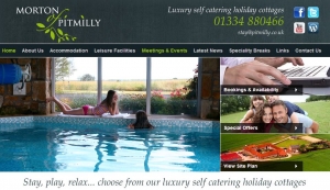
The Overall Winner: Morton of Pitmilly
There were many great features of this website that stood out for me, so it was a well deserved win for Morton of Pitmilly.
 Excellent use of photography to showcase what makes these holidays special
- Integrating “Social Proof” on the home page with the Trip Advisor Certificate of Excellence (and they have been quick to add their new SC Web Awards badge too!)
- Encouraging “social sharing” by placing buttons both top and bottom of the page, never too far away to hit “like”
- Great use of social media with their “101 things to do” page providing content ideas for sharing on Social Media and keeping the audience engaged
- I loved the creativity behind the blog by writing the diary of the family pet, which brings a familiar side to the property
- The site map is a really useful way to help potential visitors see all there is at a glance
- A clear call to action to join the e-newsletter mailing list, and links to past editions are also available
- The site is easy to navigate and has lots of detail about the different holiday options and offers available
The Winner for Wales: East Jordeston Cottages
I loved the simplicity of this website which made excellent use of images to evoke a sense of what these holidays would be like…
 A very visual website, capturing the benefits of the natural landscape to sell the destination first and foremost
- A clean and uncluttered design which is a pleasure to navigate
- Excellent use of quotes from testimonials scattered around to showcase what other guests loved about these properties
- A cute logo which is unique and memorable
- This website has a clearly integrated blog that is easy to share thanks to the integration of social sharing buttons
I originally marked the blog down because they had not updated it since last April, but now I see a new entry so well done! My recommendation here would be to use the blog more effectively to bring visitors to the website – for example instead of linking from a Facebook post to an external website (such as when sharing news of winning the Self Catering Web Awards) they could instead link to a blog post on their own website, which then links to the external site – visitors might hang around and look at those beautiful cottages while they are there 😉
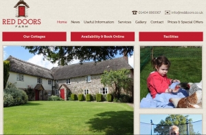
The Winner for England: Red Doors Farm
 I really loved this one, in terms of design, branding, photography and navigation. Within seconds you just know you are going to be getting real quality…
- The interior styling and photography is such that you only need be on the site a few seconds to know exactly what kind of holiday you are getting
- The design is clean, easy to navigate, uncluttered and speaks quality thanks to the attention to detail for the photography
- Key features are quickly summarised on the home page
- Quotes and extracts from leading publications give the property kudos
- Really useful floor plans available
- A blog is used to share news and updates right within the site
The only downside to this website for me was that although there is an active blog to keep the content fresh, there is no newsletter to encourage sign ups, or social media channels for visitors to follow the property and stay in touch on a more regular basis. There could be some missed opportunities there but given the press attention, being featured on ITV and the healthy bookings calendar, they are obviously doing an amazing job!
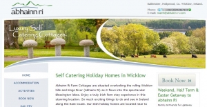
The Winner for the Republic of Ireland: Abhainn Ri
I loved the freshness to this website, a real spring-like quality that just makes you want to go and visit Ireland!
 A light bright colour scheme, easy to see what you are looking for
- plenty of images on the home page to give a sense of what these holidays are like
- The main features are highlighted on the home page for easy viewing by visitors
- Good use of social proof with the Trip Advisor widget
- Linking directly to Facebook and Twitter profiles, as well as encouraging readers to visit the blog.
- Thriving social media community (and seriously sweet videos of baby chicks :))
While this website is a bit more “static” than some of the other entries, they do an excellent job of creating the right ambience through the image galleries, and clearly have a great online following. My main advice here would be to combine the blog within the main website for more opportunities to convert browsing to booking
Winning Agency: The Goodlife Cottage Company
Any website full of beautiful Lake District images is sure to get my vote! The Good Life Cottage Company brilliantly gets on with the job of selling holidays in an easy to navigate fashion…
 Excellent integration of holiday search in a prominent place at the top of each page, making bookings quick and easy
- Featured specials on the home page, such as the upcoming valentines and half term breaks
- A clear newsletter sign up on the home page, and links to follow on Facebook and Twitter
- Thriving community on social media, and a nice integration of the Facebook Timeline photos directly into the website to encourage more interaction
- The blog is there, and is a brilliant resource for up to date local info
As with other entries I would give similar advice about taking a more “holistic” approach – by making the blog more prominent throughout the site and adding some social sharing buttons you can encourage your followers to share your news and updates, effectively doing your marketing for you!
My personal favourite
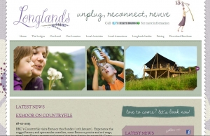
And now for my own personal favourite, which I guess is my token “girly” winner – if women are the ones most likely to book the holiday, then this one ticks all the boxes.
 As soon as I landed on the home page for Longlands Devon, and read the words “unplug, connect and revive” I almost felt my shoulders go down! The copy is written in a really unique and personal style, and together with some fantastic imagery and branding it all helps to evoke a sense of rest and relaxation – exactly what a good holiday should be about.
I love the consistency of the branding, right through to the captions in the photo gallery, and each section of the website uses images to support the content – you almost know what the words say before you have even read them!
They also have a current blog to post their latest news, and encourage people to share the blog across their favourite networks as well as follow them on Facebook.
I would love to see more videos of this place, but more than anything I want to go Glamping in Devon!
I hope this was a useful summary of what makes a great website and I will be writing more on this soon so please do sign up to the newsletter. If you have any questions or comments then please do leave them below. If you would like a personal review of your own website feel free to contact me at any time.
Finally just a quick note for clarification, although these awards were sponsored by SuperControl Online Booking System we are not affiliates or in any other way linked to Supercontrol as we have not personally used or tested the system at the time of writing. We have seen lots of examples of Supercontrol being used by self catering properties with great results, but in my personal reviews of these websites I was not looking at the booking system so much as the way in which the owners embraced a holistic approach to promoting their rentals online, developing their own marketing channels and message.


Leave a Reply
Want to join the discussion?Feel free to contribute!